


How to create an awesome blog template using Bootstrap 3 - Part I
Table of Contents
- 1. Preface
- 2. Part I � Create basic blog template with Bootstrap 3
- 3. What tools we need?
- 4. Twitter Bootstrap? What's that?
- 5. Creating a blog template
- 6. Create the home page
- 6.1 Pick up the right editor
- 6.2 Download Bootstrap and jQuery libraries
- 6.3 Create the basic structure
- 6.4 Create page header that wraps logo, navigation and search textbox
- 6.5 Create single and two-column layouts for main content and sidebar
- 6.6 Create the HTML markup for latest posts section
- 6.7 Create sidebar widgets
- 7. Create the single post page
- 8. Create the contact page
- 9. Create the about me page
- 10. Summary
1. Preface
Are you one who doesn't have great design skills but looking for stuff to create nice templates in a short time? Are you one who recently heard about this nice framework called Twitter Bootstrap and don't have much knowledge or experience to customize and create some website that represents your brand? Well folks, this tutorial is for you.
Actually, this is not just a tutorial but workshop. At the end of this workshop, you'll gain two things: First, you'll have a beautiful blog template that you could use right away for your website. Second, which is the most important thing, you'll know how to create stunning templates by yourself which jaw-drops others. Here after, you won't be googling to search for any free template, because you know how to create one with the help of Bootstrap. At the time of writing this, the latest version of Twitter Bootstrap is 3, we'll be using the same in this workshop.
Due to time constraint and content size, I've divided this workshop into two parts. In the first part, which is going to be very simple, we are going to create a complete blog template using Bootstrap. At the end of this first part, you'll have a nice blog template with home, single-post, contact and about-me pages.
In the second part, which is going to be more interesting one, where we'll see, how we can download the Bootstrap source code and customize it to create our own theme that matches our imagination.
2. Part I � Create basic blog template with Bootstrap 3
As I already said, in this part, we'll create the basic blog template using Bootstrap 3 that includes all the pages required for a typical blog like home, single-post, contact and about me pages. At the end of this part, you'll have a complete blog template that you can use right away.
The below images show how our blog template appears in mobile and desktop screens after completing this part.
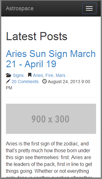
Fig 1. Blog template (Mobile)

Fig 2. Blog template (Desktop)
After completing this part, I recommend you to go through part 2 that will teach you how you can customize and create your own custom theme.
3. What tools we need?
 Text editor
 Google Chrome Browser
You need a text editor for composing html, css and js files. At the moment, my favourite one is Sublime Text 2. You could use any one of your choices. You would also need a mobile emulator. A mobile emulator helps you to see how the page appears in a preferred mobile device. We can use Google's Chrome browser for emulation which emulates the output to more than dozen devices from Amazon Kindle to Sony Xperia.
4. Twitter Bootstrap? What's that?

Twitter Bootstrap is a front-end framework developed by couple of good hearted guys from Twitter - Mark Otto and Jacob Thornton. The framework helps you to easily create website layouts through mobile first approach using its powerful grid system and lot of widgets. The framework provides a lot of CSS classes through which you can convert a plain looking unordered list into an amazing navigation component. Bootstrap helps developers who have a very little design knowledge to quickly wrap up a decent looking website.
The framework is MIT licensed and have a strong development community of over 400 contributors in GitHub. Thousands of websites uses Bootstrap for front-end decoration and some of the quick ones I found in net are: Webflow, Sentry, Engine Yard etc. Many websites that uses Bootstrap don't customize much, which make users eyes weary with the same look and feel. We are not going to do the same mistake, promise!.
Bootstrap is built on the foundation of LESS. Through LESS we can easily customize the framework according to our brand. There are many tools available like JetStrap, LauoutIt etc. helps us to dynamically craft website templates online using Bootstrap.
5. Creating a blog template
There are lot of bootstrap blog templates available online for free and paid; but, it's usually hard to find something that exactly meets your dream. Luckily with Bootstrap, creating a perfect template is not a hard job and you are going to see it how. One important thing I've to take into account is, I want the blog template should give best user experience for non-desktop (mobile, tablets) users as well. With Bootstrap 3's new mobile first approach this is terribly easy now. Starting things from the small screen helps us to focus on primary content first. We'll try to apply the same approach throughout in this workshop.
In this first part of the workshop, the following are the tasks we are going to do.
1. Create the home page
2. Create the single post page
3. Create the contact page
4. Create the about me page
2. Create the single post page
3. Create the contact page
4. Create the about me page
Yeah, that's very high-level breakdown. We'll break each into further sub-tasks on the way.
6. Create the home page
In creating the home page, we will be doing most of the plumbing work required for other pages as well. Before getting into code, you should mentally visualize about the layout, the primary elements, their placement in the page from small to big screen. You could use a rough paper or some online tool like Balasamiq to draw the mockups that resides in your mind. I've used Balasamiq.
What you see below are the mockups that I've come up for the home page, both mobile and desktop.
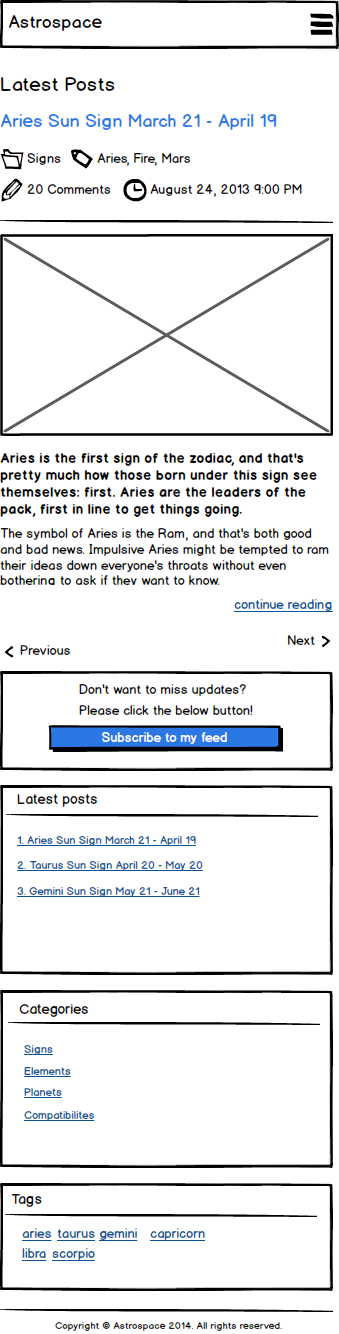
Fig 3. Home page mockup (Mobile)
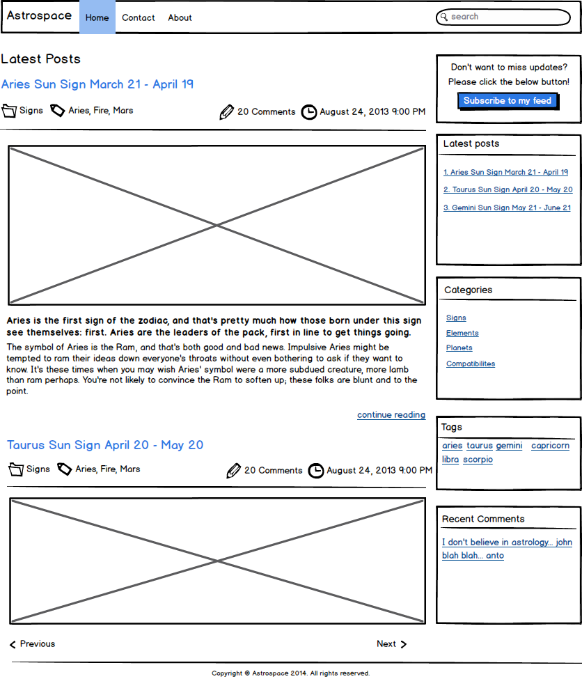
Fig 4. Home page mockup (Desktop)
Do you like the design? Pretty simple and straight, isn't it? Pardon me, I haven't kicked my imagination horse too hard, I guess!
In mobile devices, we want the site to flow as a single column. In tablets, desktops we want the content stream to divide and flow into two columns. The layout is composed of header and footer which is shared across pages. If you scan the design, the important elements are header (which contains logo, navigation and search textbox), main body content (displays the latest blog posts), sidebar and footer. Not only for the main elements, we should think about the structure and arrangement for each small element like the repeating post section, sidebar widget and others. The design pretty much tells the story about most of them.
I hope we are clear with the design, it's time to make the playground ready!
- Pick up the right editor
- Download Bootstrap and jQuery libraries
6.1 Pick up the right editor
There are lot of text editors available for editing html, css and js files. Couple of the tools I frequently use are Notepad++ and SublimeText 2. Now-a-days, I spent most of the time with SublimeText 2. You can use any one of them or some other.
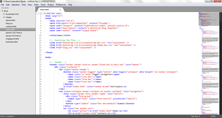
Fig 5. SublimeText 2
6.2 Download Bootstrap and jQuery libraries
You can download Bootstrap library from their website.

Fig 6. Bootstrap Website
The Bootstrap website itself designed using Bootstrap 3, you could already feel what we are up-to, don't you? You could see two big buttons "Download Bootstrap" and "Download Source". Please click the first one. The later one will download the complete source code which we'll be doing anyway in Part 2.
Bootstrap has dependency with jQuery. You can download the latest version of jQuery from their website. You could also refer from CDN if you wish.
Create a new folder called MyBlogTemplate somewhere in your hard drive that should include both the downloaded libraries.
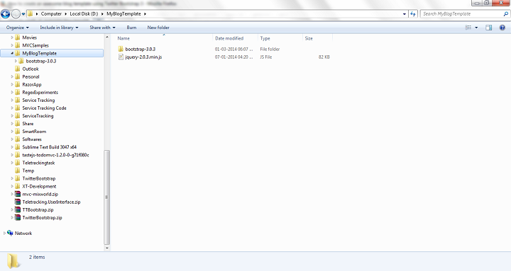
Fig 7. Project folder structure
If you are using SublimeText 2, you can open the folder MyBlogTemplate using the "Open Folder" option from the "File" menu.
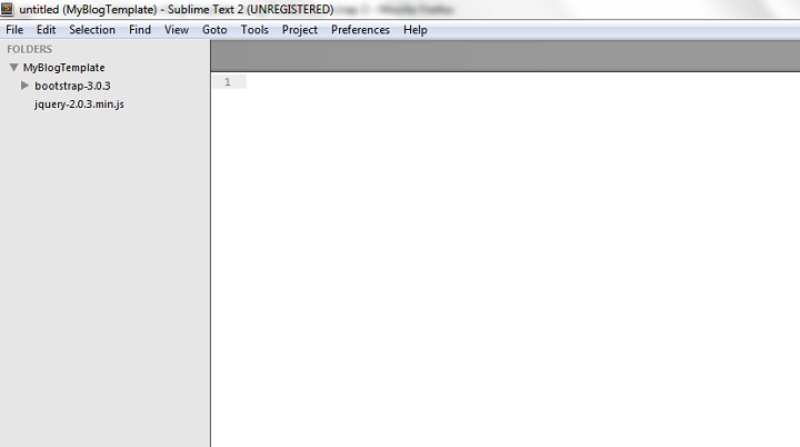
Fig 8. Project folder
If you see the home page mockup (Fig 3 & 4), its body content is divided into two: main or primary content which contains the list of latest posts and sidebar which contains stack of widgets. In mobile, both the main content and sidebar occupies 100% of the screen. Since, we've more room in desktop, the primary content takes 2/3rd (67%) and the sidebar takes 1/3rd (33%) of the entire screen.
I've broken down the complete home page creation tasks into the following subtasks.
a. Create the basic structure
b. Create page header that wraps logo, navigation and search textbox
c. Create single and two-column layouts for main content and sidebar
d. Create the HTML markup for latest posts section
e. Create sidebar widgets
b. Create page header that wraps logo, navigation and search textbox
c. Create single and two-column layouts for main content and sidebar
d. Create the HTML markup for latest posts section
e. Create sidebar widgets
For each task, we are going to leverage Bootstrap to create the markup.
6.3 Create the basic structure
Here we go with our first task - preparing the basic HTML.
Create a new file with name index.html under the folder MyBlogTemplate. Fill the file with the below stuff.
1
2
3
4
5
6
7
8
9
10
11
12
13
| <!DOCTYPE html><html lang="en"><head> <meta charset="utf-8"> <meta name="viewport" content="width=device-width, initial-scale=1.0"> <meta name="description" content="A Bootstrap Blog Template"> <meta name="author" content="Vijaya Anand"> <title>Home</title></head><body></body></html> |
Listing 1. Base markup in index.html
You already know about most of the pieces which I filled above, though, I would like to explain about couple of them: DOCTYPE and Viewport meta tag.
6.3.1 HTML5 DOCTYPE
1
| <!DOCTYPE html> |
Listing 2. DOCTYPE tag
We are going to build our pages in HTML5. The above line tells the browsers, "Hey, this page is written in HTML5, please use the same to validate".
More about DOCTYPE

The <!DOCTYPE> declaration must be the very first thing in your HTML document, before the <html> tag.
The <!DOCTYPE> declaration is not an HTML tag; it is an instruction to the web browser about what version of HTML the page is written in.
In HTML 4.01, the <!DOCTYPE> declaration refers to a DTD, because HTML 4.01 was based on SGML. The DTD specifies the rules for the markup language, so that the browsers render the content correctly.
HTML5 is not based on SGML, and therefore does not require a reference to a DTD.
Tip: Always add the <!DOCTYPE> declaration to your HTML documents, so that the browser knows what type of document to expect.
6.3.2 Viewport meta tag
1
| <meta name="viewport" content="width=device-width, initial-scale=1.0"> |
Listing 3. Viewport meta tag
<meta> tags are uses to convey metadata information (description, keywords, author) about HTML documents. The above meta-tag gains more importance in regard with mobile browsers. It tells the browser to take device width as the virtual viewport width (see the below help section) and set the zoom level to default, this makes the browser not to completely zoom out the site and show it small.
A tale of two viewports: layout viewport and visual viewport

George Cummins explains the basic concept best here at Stack Overflow:
"Imagine the layout viewport as being a large image which does not change size or shape. Now image you have a smaller frame through which you look at the large image. The small frame is surrounded by opaque material which obscures your view of all but a portion of the large image. The portion of the large image that you can see through the frame is the visual viewport. You can back away from the large image while holding your frame (zoom out) to see the entire image at once, or you can move closer (zoom in) to see only a portion. You can also change the orientation of the frame, but the size and shape of the large image (layout viewport) never changes."
Before diving into further development let's reference the Bootstrap and jQuery libraries in our index file.
6.3.3 Reference jQuery and Bootstrap libraries
1
2
3
4
5
6
7
8
9
10
11
12
13
14
15
16
17
18
19
20
21
| <!DOCTYPE html><html lang="en"><head> <meta charset="utf-8"> <meta name="viewport" content="width=device-width, initial-scale=1.0"> <meta name="description" content="A Bootstrap Blog Template"> <meta name="author" content="Vijaya Anand"> <title>Home</title> <!-- Bootstrap CSS file --> <link href="bootstrap-3.0.3/css/bootstrap.min.css" rel="stylesheet" /> <link href="bootstrap-3.0.3/css/bootstrap-theme.min.css" rel="stylesheet" /></head><body> <!-- Jquery and Bootstrap Script files --> <script src="jquery-2.0.3.min.js"></script> <script src="bootstrap-3.0.3/js/bootstrap.min.js"></script></body></html> |
Listing 4. Referencing Bootstrap and jQuery libraries
We've referenced two CSS files: bootstrap.min.css and bootstrap-theme.min.css. Thebootstrap.min.css is the basic CSS file, which is mandatory. The second one, bootstrap-theme.min.css is optional which decorates the Bootstrap components with gradient and other arbitrary styles - a pleasing effect to the components!
6.3.4 Create the foundation
The layout can be segmented into three regions: header, body and footer. The header section contains the logo, navigation and search-box. The main content section varies from page to page. The footer section contains the typical copyright information.
To create these sections, let's throw some basic elements under <body>.
1
2
3
4
5
6
7
8
9
10
11
12
13
| <body> <header> -- Logo, Navigation & Search Bar-- </header> <div id="body"> -- Site Main content -- </div> <footer> -- Copyright information -- </footer></body> |
Listing 5. Header, body and footer elements
We have used HTML5 elements for header and footer sections. The primary content of the body is represented by an empty div. If you open the file in browser, you could see the below screen - nothing interesting at the moment!
Fig 9. Home page
How about seeing the output in mobile mode? If you are using chrome, you could TURN ON the emulation mode by pressing F12. If you did, you could see a new container below the usual one which contains a menu called Emulation. If you don't see the Emulation tab make sure you have turned on the "Show 'Emulation' view in console drawer" from the Settings.

Fig 10. Emulation mode
You can select any device from more than dozen options, I've selected the Apple iPhone 5. On clicking the Emulate button you could see the browser output transformed into iPhone screen. Cool, isn't it?
Fig 11. Page in iPhone5
6.3.5 Bootstrap's container class
The page looks very normal in both desktop and mobile screens. Though the <header> and <footer> elements are not styled by Bootstrap, it overrides the default font-system and applies some predefined styles to the h1, h2..., anchor elements. Bootstrap mostly applies styles through CSS classes. If you notice the <header> and <footer> elements (Fig. 9 & Fig. 11), there is no much room for the placeholder texts resides inside them. It would be great if we set some padding for each of them to help their children get more room for breathe.
Before you think to create a CSS class and apply to each element, I would like to reveal you the first important class from Bootstrap called container. Containers are used to centre an element with padding at both left and right sides. It sets a fixed width to the element but the set width will be changed based on device's width.
Instead of directly applying the container CSS class to the <header> and <footer> elements, please create a child <div> element and apply to it. Applying the class directly on the <header> and <footer> element will not give the desirable design which we want here.
After you've done with the changes, the markup should look as below.
1
2
3
4
5
6
7
8
9
10
11
12
13
14
15
16
17
| <body> <header> <div class="container"> -- Logo, Navigation & Search Bar �- </div> </header> <div id="body" class="container"> -- Site Main content -- </div> <footer> <div class="container"> -- Copyright information � </div> </footer></body> |
ur
0 comments:
Post a Comment