


There are three major complaints with using bootstrap.
- All of the sites look the same.
- There are so many classes in the HTML where they don't strictly belong
- It's a whole bunch of stuff that you don't need.
LESS or SASS
version directly gives you a lot more power. You can customize things
using variables to make them look the way that you want without fighting
the framework. You can get rid of the "unnecessary" classes to give it
some semantic loving. And, if you so choose, you can only include the parts of it that you want.We prefer
SASS, so let's look at how you would lay out a site like this using bootstrap-sass. (At the level that we will be speaking about it, it's the same when using the LESS version.)
The Twelve Column Grid: How does it work?
This design is laid out nicely using the a grid of 12 columns. There's a 2 column side bar, and then a 10 column main content bar with columns inside of that. Bootstrap has a 12 column grid by default. Should be easy right? Read on.The way that the Bootstrap grid works to create a set of
.col-* classes, for each column width and each device size. The width is calculated as a percentage, $column / $grid-columns, and they are float: left with the left and right margin of $gutter-width / 2.
The width property is basically wrapped in a media query, so that when
the view point is out of bounds then it defaults to full width, and the
columns become rows.In order for the margins to work on the beginning and end of the rows, you need to wrap everything in a
.container class, put .rows in side of that, and then put in your content using one of the .col-* classes to represent columns of certain widths and certain breakpoints. The .row class defines both a new row as well as a nested grid. There is negative margin (of $gutter-width / 2 naturally) to make the first and last column line up correctly, and every time you have a .row the "percentage width" is effectively recalculated based upon that container.The post The Subtle Magic Behind Why the Bootstrap 3 Grid Works has a great visual walk through of what that means.
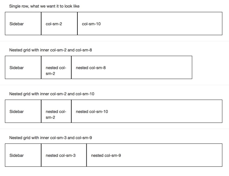
In the example above, the over all structure looks like one really big
row, with a col-*-2 side bar, and a col-*-10
main content area. The sidebar height is pretty independent of the
content height, so there's no way to split up the content into multiple
rows. Inside of the main content area, we want to have a row of col-*-10 and then a bunch of col-*-2 and col-*-8 that match up to the overall grid of the page. Lower down on the page there are col-*-3, col-*-4 and a col-*-3.The problem is that if we want to have the overall page be 2 - 10, we'll need to define a
row inside of the "content" area of the site. But if we define a row inside of the huge, page spanning col-*-10
that represents the content area, that will give us a nested grid of
twelve columns. And so you'll end up with a wonky 14 column grid, where
the "first 2 columns" are one size, and the other "12" columns are
another size. In other words, the nest grid won't match up with the
"page grid" that we want to lay things out on.Here's the outline of what we want to make right, but isn't:
.container
  .row
    .col-sm-2
      Sidebar content
    .col-sm-10
      .row
        .col-sm-2
          avatars and icons
        .col-sm-8
          comment text
The nest grid doesn't line up with the outer page grid.
- Using a nested row, with col-sm-2 and col-sm-8 doesn't work because we are in a 12 column nested grid and so the col-sm-2 is too small, and the col-sm-8 doesn't go to the end of the row.
- The first way of "making it add up to 12", 2 + 10, leaves the "avatar" row too narrow.
- The second way, 3 + 9, leaves the avatar row too wide.
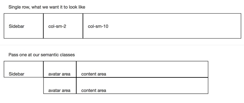
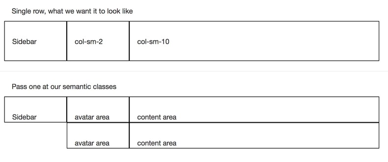
This will solve two problems: 1. We will be using semantic CSS classes so our HTML is cleaner. 2. We will actually be able to lay out the page correctly.
Let's go a little deeper.
How col- classes are defined
When you load up bootstrap, it uses default variables that you can override to build the the CSS. There are many different things that you can tweak, more than are listed out on the bootstrap customization page, so learning how to navigate and read the source files is pretty important. The key ones for the grid are:| Variable | Description | Default Value |
|---|---|---|
$grid-columns |
number of grid columns | 12 |
$grid-gutter-width |
space between column content | 30px |
$screen-xs-min |
xs cut off | 480px |
$screen-sm-min |
sm cut off | 768px |
$screen-md-min |
md cut off | 992px |
$screen-lg-min |
lg cut off | 1200px |
$screen-xs-min, $screen-sm-min etc) then the col- classes have a width specified as a percentage. If the viewpoint is smaller than this, then there is no width and it's 100%.
In that case, if the browser is smaller than this width it displays
the "columns" on top of each other. These cut off points are defined as
$screen-*-min.There are 4 different column types, each with their own prefix
col-xs-, col-sm-, col-md-, and col-lg-. This means "I will be a column on devices this size or bigger, otherwise I'm going to be a 'row'."These classes work using media queries, and they can be layered: you can also specify multiple column types for a given element. Perhaps on a medium screen you want it three across, while on a small screen two across?
<div class="col-md-4 col-sm-6">. When specifying classes on the DOM the order of the -md- and -sm- doesn't really matter, but when using the mixins it does.If you want a particular element to always be laid out horizontally, specify
col-xs-. In practice, start out with using col-sm- which makes it a column for devices >768px and rows for smaller devices.Using semantic classes
How do we translate from the bootstrap classes to something semantic? Let's start first with the bootstrap classes, and then see how to make them semantic.<div class="container">
<div class="row">
<div class="col-sm-2">
Sidebar
</div>
<div class="col-sm-10">
<div class="row">
<div class="col-sm-2">
avatar area
</div>
<div class="col-sm-8">
content area
</div>
</div>
<div class="row">
<div class="col-sm-2">
avatar area
</div>
<div class="col-sm-8">
content area
</div>
</div>
</div>
</div>
</div>
scss to have it use the class properties that are defined in bootstrap:<div class="container">
<div class="main_body">
<div class="sidebar">
Sidebar
</div>
<div class="main_content">
<div class="item">
<div class="avatars">
avatar area
</div>
<div class="content">
content area
</div>
</div>
<div class="item">
<div class="avatars">
avatar area
</div>
<div class="content">
content area
</div>
</div>
</div>
</div>
</div>
@extend
another. The plus side of this is that you don't need to do anything
special to make it work, SASS can just figure it out on it's own and
when you are writing CSS you don't need to do anything differently. The
downside is that if you have a whole set of class properties that need
to work together, for example if you are using media queries to change
things on different sizes, @extend may only get you part of what you want.Lets use the extend method to turn the above into what we want.
.main_body {
  @extend .row;
  .sidebar {
    @extend .col-sm-2;
  }
  .main_content {
    @extend .col-sm-10;
  }
  .item {
    @extend .row;
    .avatars {
      @extend .col-sm-2;
    }
    .content {
      @extend .col-sm-10;
    }
  }
}
Mixins
You can look at the source of the Bootstrap-Sass mixins, which is what we will be using to make the layout. If you want to understand how the normal grid classes are generated, look at the main grid.scss file and trace themake-grid
method. This follows a slightly different code path than the mixins
that we will be using directly, but is helpful to really understand what
is going on under the hood.| Mixin | "Standard Class" | Description |
|---|---|---|
| @mixin container-fixed() | .container |
Creates a .container-type class |
| @mixin make-row() | .row |
Creates a .row-type class |
| @mixin make-xs-column($columns) | col-xs-$columns |
Creates col-xs--type column of a specific width |
| @mixin make-sm-column($columns) | col-sm-$columns |
Creates col-sm--type column of a specific width |
| @mixin make-md-column($columns) | col-md-$columns |
Creates col-md--type column of a specific width |
| @mixin make-lg-column($columns) | col-lg-$columns |
Creates col-lg--type column of a specific width |
-offset, -pull, and -push variants, you can just layer as many in as you need.)The format in your SASS will look something like this:
.main_body {
  @include make-row();
}
@include method is actually calling a SASS
function to generate the properties. We're going to use this to
property up our semantic classes:.main_body {
@include make-row();
.sidebar {
@include make-sm-column( 2 );
}
.main_content {
@include make-sm-column( 10 );
}
.item {
@include make-row();
.avatars {
@include make-sm-column( 2 );
}
.content {
@include make-sm-column( 8 );
}
}
}
So we've managed to clean up the class names, but we still don't have it working.
Redefining grid-columns
The trick here is to realize that SCSS is actually evaluated top down, and by the time it gets to our code the previous properties have already been generated. If we change$grid-columns to 10 above the .item definition and then set it back to 12 immediately below, when the functions are called they will recalculate the column width percentages. Like so:.main_body {
@include make-row();
.sidebar {
@include make-sm-column( 2 );
}
.main_content {
@include make-sm-column( 10 );
}
$grid-columns: 10;
.item {
@include make-row();
.avatars {
@include make-sm-column( 2 );
}
.content {
@include make-sm-column( 8 );
}
}
$grid-columns: 12;
}
It's almost too easy!
Ordering includes
The final thing to mention is that if you want to do something like<div class="col-md-4 col-sm-6"> using semantic CSS, you need to make sure that you order the @includes from small to large to make sure that the correct media query gets triggered:.awesome-class {
@include make-sm-column( 6 );
@include make-md-column( 4 );
}
.awesome-class {
    position: relative;
    min-height: 1px;
    padding-left: 15px;
    padding-right: 15px;
    position: relative;
    min-height: 1px;
    padding-left: 15px;
    padding-right: 15px;
}

@media (min-width: 768px) {
    .awesome-class {
        float: left;
        width: 50%;
    }
}

@media (min-width: 992px) {
    .awesome-class {
        float: left;
        width: 33.3333333333%;
    }
}
@includes, then the order the of the media queries will be reversed in the CSS, and the col-md-4 would get shadowed. That's why the order is important.
0 comments:
Post a Comment